





.svg)

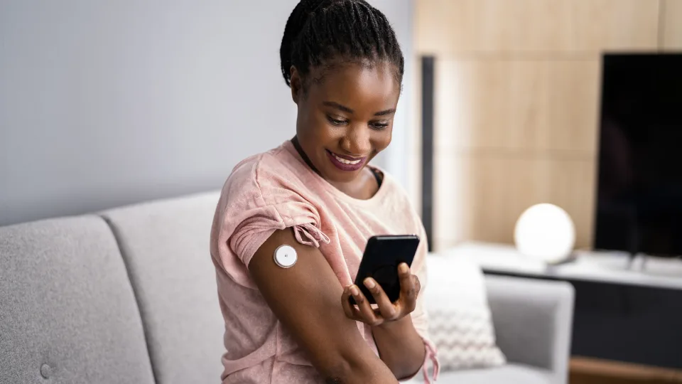


A colourful glucose graph can make breakfast look like a pass-or-fail test. A bowl of oats produces a rise. A walk after lunch looks smoother. A cookie creates a spike. When the numbers arrive on your phone all day, it is tempting to turn them into a personal nutrition scorecard.
They show one changing measure at one moment in time.
Continuous glucose monitors, or CGMs, are valuable clinical tools for many people with diabetes. They can also offer interesting feedback in research. But for a healthy person using one out of curiosity, a graph is only one stream of information. It cannot tell you whether a meal was nourishing, whether you enjoyed it, or how you will feel over months and years.
What a graph can and cannot tell you
Glucose naturally moves after eating, exercise, stress, sleep and illness. A rise after a meal is a normal part of being human. The height and shape of that rise can vary between people and even in the same person on different days.
Research in people without diabetes is still developing. A systematic review found that CGMs may give immediate feedback, but evidence on meaningful health outcomes is scarce. Another recent review found possible benefit for people with prediabetes, but no appreciable benefit for healthy people with normal glucose levels.
That distinction matters. A device can give you more data without giving you a better decision.
Why single-food verdicts go wrong
It is easy to blame one food when a graph looks dramatic. However, meals come with real-life context. What you ate earlier, how much you slept, whether you exercised, your menstrual cycle, stress levels and the timing of the meal can all affect what you see.
A glucose response also says nothing on its own about protein, fibre, vitamins, enjoyment or the role a food plays in a balanced eating pattern. A piece of fruit may raise glucose and still be a useful source of fibre and nutrients. Likewise, a lower glucose response does not automatically mean a food is healthier. A food rich in fat, for example, may produce a flatter glucose curve while still being something to consider in the context of your overall eating pattern.
The risk is that curiosity turns into food anxiety. You may start avoiding ordinary foods, chasing a perfectly flat line or eating less variety just because the app made a number feel urgent.
A better way to use food feedback
If you already use a CGM, zoom out. Look for broad patterns over time rather than treating one meal as a verdict. Focus on practical questions: do you feel satisfied after breakfast? Does a short walk after lunch help your energy? Are you eating regularly enough to avoid getting overly hungry later? Does starting an exercise session with a slightly raised glucose level actually help you perform better?
Then place the graph alongside other evidence. A useful meal usually includes foods you enjoy, enough nourishment for your day and an eating pattern you can sustain. A clear, comfortable pattern matters more than a perfectly flat chart.
If you have symptoms, a family history of diabetes or concerns about your blood sugar, speak to a healthcare professional. A consumer CGM graph is not a diagnosis and does not replace appropriate testing.
The takeaway
Curiosity and understanding your personal response to foods and your environment can be useful, but detrimental when not properly contextualised. Your body changes throughout the day, and at times from day to day too. CGMs have a clear clinical role, but a graph alone cannot rank meals as good or bad.
Before you let a graph change how you eat, ask whether it is helping you build a calmer, more varied and more sustainable routine.
Similar articles
Get updates from us
.svg)


